|
Home > Korean cars Emblems & Logos Meaning |
|
| |
|
 English -
|
||||||||||||||
| |


|
|
| Brand names | Origin, Meaning, History | ||||||||||||||||||||
|---|---|---|---|---|---|---|---|---|---|---|---|---|---|---|---|---|---|---|---|---|---|
|
Note: If you want to see the car photos of each brand, please tap or click the brand name. |
|||||||||||||||||||||
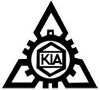
KIA |
*1 for bicycles, *2 for bicycles, motorcycles, three-wheeled trucks 【 Origin of Emblem and Logo 】The KIA emblem logo is based on the company name "KIA", and the emblems design saw uncountable changes over its history. 【 History of Emblem, Logo, and Company 】In 1944, Chul-Ho Kim found Kyungsung Precision Industry. The company manufactured bicycle parts and steel pipes by hand. |
||||||||||||||||||||
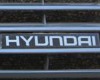
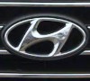
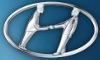
HYUNDAI |
*1 for advertisement, *2 two people shaking hands 【 Origin of Emblem and Logo 】The HYUNDAI emblem logo is derived from "H" the initial of HYUNDAI and the oval for the earth and its global business expansion. "H" represents two people shaking hands, and there are two theories about the details of these two people. The 1st theory: the two people are representatives of the company's management and employees. The 2nd theory: the two people are the company representative and customer who is satisfied with its product. The reason why the "H" is slanted, is a symbol of the company's positive attitude toward the future. 【 History of Emblem, Logo, and Company 】In December 1967, Hyundai Motor Company was founded by Chung Se-yung, based on Hyundai Motor Industrial Company founded by his brother Chung Ju-yung in 1946. Its predecessor, the automobile company, was a subcontractor for the US Army Weapons Factory. The establishment of the company was related with Ford's investment, the first car launched in November 1968 was Ford Cortina. |
||||||||||||||||||||
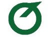
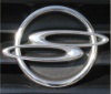
RENAULT SAMSUNG |
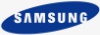
*1 for vehicle, *2 for corporate 【 History and origin of Emblem and Logo 】The Renault Samsung emblem logo on the front grill is derived from the storm's eye. Commonly known as the dynamo emblem, it expresses the following three things. 【 History of Company and Brand 】Samsung Group's Chairman Lee Kun-Hee directed to develop the plan to enter the automobile business in December 1987, then Samsung Motors was established in March 1995. After that, Samsung Motor and Nissan signed a technology agreement, Samsung Motor introduced Nissan's automobile factory equipment and built the automobile production lines. In March 1998, the first mass-produced vehicle SM5 was launched. However, the business environment deteriorated due to the Asian financial crisis, and the Corporate Rehabilitation Law was applied to Samsung Motors in June 1999. Renault Samsung Motors was born in July 2000 when Renault acquired Samsung Motors. The company name is sometimes called as RSM, which stands for Renault Samsung Motors. 【 Origin of Company logo 】Renault Samsung uses the same corporate logo as the Samsung Group. So the corporate logo has a different design from the mounted one on vehicles. The oval shape symbolizes the world and universe, the blue color of oval expresses the stability and reliability. This logo design comes with the will of "becoming a familiar company for customers". 【 Corporate philosophy 】The corporate philosophy of Renault Samsung is "RIGHT", which consists of the initials "Reliable, Identity, Genuine, Honest, and Transparent". |
||||||||||||||||||||
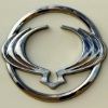
SSANGYONG |
*1 for domestic, *2 for export, some domestic 【 Origin of Emblem and Logo 】The SSANGYONG emblem logo for Korean domestic has a motif of "S" the initial of SSANGYONG, while the design for export reminiscent of two flying dragons, dragon wings, and the shape of deer horns. 【 Details of Emblem and Logo for Korean domestic 】The Korean domestic emblem logo has been used since 1992 and is commonly known as the Three circle logo. These three circles express the following three corporate philosophies of SsangYong Motor Company. 【 Details of Emblem and Logo for overseas 】The emblem logo for export has been used since 1997 and is commonly known as the Wing logo. The design is based on the hood ornament of the first model CHAIRMAN. Why was the emblem design divided between Korean domestic and overseas? SSANGYONG and Opel brought to court about the similarity between the three-circle logo and Opel emblem logo. As a result, the SSANGYONG side lost the case. Since then, the design was divided between Korean domestic and overseas. Recently, this emblem logo is also used in some Korean domestic models such as LEXTON and TIVOLI. 【 History of Company and Brand 】The history of SsangYong Motor Company began when Ha Dong-hwan established Ha Dong-hwan Motor Workshop in January 1954. In July 1963, Ha Dong-hwan Motor Workshop and Dongbang Motor Company merged into Ha Dong-hwan Motor Company. After changing its company name to Dong-A Motor in February 1977 and taking control of Keohwa in December 1984, the company was taken over by SsangYong Business Group in November 1986. |
||||||||||||||||||||

|
Note: If you want to see the car photos of each brand, please tap or click the brand name. |
 |
|
|
|
|
|
|
|
Home > Korean cars Emblems & Logos Meaning |
|
||||||||||||||
|
|||||||||||||||
| Copyright © 2020 Origin Island All Rights Reserved. |