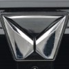
【 Origin of Emblem and Logo 】
The Mahindra & Mahindra (M&M) emblem logo is derived from "M" the initial of Mahindra. The abstract and modern design was created by various ideas.
【 History of Emblem, Logo, and Company 】
The company was founded in 1945 and started producing passenger cars two years later. For more than 50 years, passenger cars manufactured were attached with the simple word mark with a modern design of characters "Mahindra".
The "Road Ahead" emblem logo has been adopted since 2000. This design looks like a road going into the distance, has several meanings. It means the bright future possibilities, the prospects for technological innovation of products, and the ambitions of each customer, supported by the company.
The "Twin Peaks" emblem logo was announced in 2021. This design was created by Pratap Bose, Executive Vice President and Chief Design Officer, M&M Ltd. According to interview comments of Pratap Bose, this design change expresses the liberating feeling that customers can go wherever they want, when they want by the complete style, vehicle control, and secure security. The 2M's within the design symbolize an expansive and exciting future which is based on a solid heritage. The SUV products are the physical manifestation and the softer side is "explore the impossible".
The old "Road Ahead" logo will not end and will continue to be used for the commercial vehicle products and farm equipment sector.
|


 English -

