|
Note: If you want to see the car photos of each brand, please tap or click the brand name.
|
Cadillac
|
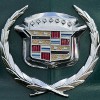
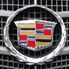
The Cadillac emblem logo is derived from the family crest of Antoine de la Mothe Cadillac, the founder of the city of Detroit. The first car emblem logo was designed by European artist Piet Mondrian, featured the following design elements:
・The Crown:
The six ancient counts of France, with the pearls being descendancy from the royal counts of Tolouse.
・The Merlettes:
These birds appear in trios to symbolize the Holy Trinity, with three on one side representing the nobility of the mother's lineage and the other side representing the father's noble lineage. These birds are derived from the time of the Crusades.
・Color Stripes:
Black means superiority, gold means riches, red meand boldness, silver means virtue, and blue means valor. The black stripes are derived from an award for Crusader service.
・The Laurel Wreath:
A symbol of aristocracy and victory.
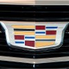
The Cadillac emblem logo design was changed as follows since 2000.
・The crown and the merlettes were removed.
・The laurel wreath was sharpened into a modern form.
The current design was began appearing on production models since 2014. The design changes are as follows.
・The extreme widening of the crest
・The Laurel Wreath was removed.
|
CHEVROLET
|
|
|
|
|
|
|
|
|
|
|
The Chevrolet's "bowtie" emblem logo expresses the heritage and vision of Chevrolet, and has been used on the models at Chevrolet dealerships since 1913. How that the bowtie is derived to be remains a mystery, though there are four different theories that have been posed over the years.
The most probable theory: According to the testimony of Chevrolet co-founder William Durant's wife, her husband first got the idea from a Virginia newspaper during a vacation in Hot Springs in 1912. Because the advertisement for Coalettes (little coals) had a strikingly similar bowtie. This advertisement was published in the newspapers the same exact time that Durant released the Chevrolet's new bowtie.
The 2nd theory: The bowtie was inspired by wallpaper that Durant saw in a French hotel room in 1908.
The 3rd theory: According to the testimony of Durant's daughter, Durant crafted the bowtie on a napkin during a family dinner.
The 4th theory: Chevrolet's founder, Louis Chevrolet, was born in Switzerland and had the bowtie designed in honor of the Swiss flag cross.
|
CHRYSLER
|
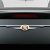
The CHRYSLER emblem logo saw uncountable changes over its history. From the mid 1920s to the mid 1950s, CHRYSLER models adopted the brand's first emblem logo, "seal of approval". This designed by Oliver Clark, was consisted of a wax seal with a ribbon peeking out from the lower right. Clark is one of the early 18 members of the company's founding. Clark said the seal is synonymous with quality. The decorated lightning bolt pattern is actually "Z", honoring the early Zeder prototype named after chief engineer Fred Zeder. The wax seal was retired in 1954, and CHRYSLER models from 1955 to the 1980s didn't have a consistent emblem logo.
CHRYSLER went through a rebirth of the original wax seal. The rebirthed wax seal was on the wings that recalled the legacy of CHRYSLER. This CHRYSLER's winged seal was adopted on CHRYSLER models from 1990 to 2009.
The CHRYSLER winged emblem logo from 2009 sees a pair of elegant silver wings matched with a CHRYSLER inscription on deep blue background in the middle. Despite the elimination of historic wax seal, the new design expresses the company's legacy through the trademark silver wings and looks sophisticated and modern thanks to graceful shape and noble silver color.
CHRYSLER's Pentastar was used as the Chrysler's corporate logo, and emblazoned on the passenger-side fender of old Chrysler models from 1963 to the 1970s. This corporate logo was created by the Lippincott & Marguiles design firm in the early 1960s, was selected from among over 800 other designs. The Pentastar do not stand for the five car divisions. The Pentastar was created in 1962 when Chrysler Corporation President Lynn Townsend decided the company needed a new symbol to represent all of the corporation's brands.
|
|
DODGE (RAM)
|
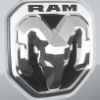
The DODGE emblem logo is famous for the iconic ram's head. Various designs have been adopted before the iconic ram's head. A round shield type with their initials "DB : Dodge Brothers" interlocked, two overlapping boomerang shapes that suggested progress and forward motion "Forward Look", a fractured deltoid shape "Fratzog", DODGE script with red Pentastar and so on.
RAM means authority, force, fearlessness, and virility. The ram's head emblem logo is derived from the hood ornaments of DODGE vehicles in the early 1930s. By the 1990s, hood ornaments were out of fashion. Then the consistent and identifiable ram head emblem logo was needed and used on almost every DODGE model between 1993-2010.
RAM became its own brand when FIAT acquired CHRYSLER in 2009. Because the ram's head design was more appropriate for the strength and power of RAM trucks, DODGE relinquished the emblem logo to the pickup brand RAM. Once RAM began exclusive use of the emblem logo from 2011 model year, DODGE needed a new design one.
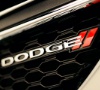
DODGE studied the new corporate logo design together with Wieden & Kennedy ad agency, famous for the Nike corporate logo design. DODGE wanted to ditch the reputation of RAM in favor of a "forever young" attitude that emphasized the performance-driven history will drive the brand into the future. Thus, the new design team turned to the popularity of CHRYSLER's STR (Street & Racing Technology) group, which developed DODGE Viper. The result was a simple corporate logo with twin red racing stripes after DODGE script. The twin red racing stripes suggested speed and agility. While the new corporate logo was originally intended to be limited to company communications, advertising, internet and merchandising, it began appearing on vehicle grilles from the 2012 model year.
DODGE was originally a subsidiary of CHRYSLER Company and is now an automobile manufacturer belonging to FCA (Fiat Chrysler Automobiles N.V.).
|
Ford
|
|
|
|
|
|
|
|
|
|
|
The Ford emblem logo is generally called "Ford oval", was created by the company's first chief engineer/designer Childe Harold Wills. Wills is a friend of Ford's who designed and printed business cards, used the calligraphy from his own cards to stylize the letters of "Ford". The first Ford oval was originally used by British agents Perry, Thornton and Schreiber in 1907. They were forerunners of the original Ford Motor Company Limited of Great Britain. This oval was used to advertise Ford as the "hallmark for reliability and economy". By combining the script and oval, Ford created the definitive emblem logo in 1911. The Ford Model A was the first Ford vehicle to equip with the Ford oval as a radiator badge. With the familiar deep royal blue background, this design was used on many cars until the end of the 1950s. The blue oval then disappeared from the various bonnets and grilles of cars until the mid-1970s, with just the letters "Ford" appearing instead. The Ford oval was still used consistently as the corporate logo during this period. Since 1976, the blue and silver Ford oval has been used as an identification emblem logo on all Ford vehicles, providing an easily recognisable and consistent brand.
|
HUMMER
|
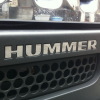
The HUMMER emblem logo is expressed only by the letters "HUMMER".
The High Mobility Multipurpose Wheeled Vehicle (HMMWV, colloquial : Humvee, M988) is a family of light, four-wheel drive, military trucks and utility vehicles produced by AM General since 1985. Arnold Schwarzenegger, Austrian-American Actor worshiped the HMMWV. In 1990, He contacted AM General that this vehicle should be sold to the general public. After that, the company was initially hesitant, HUMMER was introduced to the civilian market in 1992. The first two Hummers to be sold were purchased by Schwarzenegger. In 1998, AM General sold the brand name to General Motors, but continued to manufacture the vehicles. Shortly thereafter, HUMMER was renamed as HUMMER H1 in 1999 by GM. HUMMER H2, which is smaller than H1 and has both driving performance and comfort, was released in 2002. HUMMER H3, which is smaller than H2, was released in 2006. In 2010, GM bankrupt was happen and the Hummer brand under was abolished.
|
Jeep
|
The Jeep emblem logo is expressed only by the letters "Jeep".
|
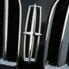
LINCOLN
|
How that the LINCOLN emblem logo is derived to be remains a mystery, though there are five different theories that have been posed over the years.
The most popular theory: It was based on the Continental star, which was adapted in the 1950s when the LINCOLN and Continental lines merged.
The 2nd theory: It was based on the coat of arms used by the brand since the 1930s, which involved a red cross in the center of a shield.
The 3rd theory: It represents a compass with hands directed to the four corners of the earth. This showed the brand's intent to spread its vehicles across the world.
The 4th theory: It represents the celestial body that reflects the brand's opulence and radiance, sometimes called the LINCOLN Star.
The 5th theory: It has no real meaning behind it.
Regardless of the origin of LINCOLN's emblem logo, the iconic four-point star has become synonymous with the luxury and prestige of the brand over the years. Current design has remained nearly unchanged since 1972.
|
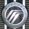
MERCURY
|
The MERCURY emblem logo represents the letter "M" composed of three parallel arc lines enclosed in a circle, which indicates an initial of the brand name. This design was called as nicknames like the "waterfall," "winding road," and "hockey stick," took on multiple meanings, including being a depiction of the iconic winged helmet of the Roman god Mercury (Mercurius). The three parallel arc lines suggests mobility. In the 1940s, this base design was born, has made a minor change of in the mid 1980s. Before this design was adopted, it was a side profile of Mercury with the iconic winged helmet.
|
SATURN
|
|
|
|
|
|
|
|
Reference
|
|
|
The SATURN emblem logo represents Saturn, one of the solar system’s planets, as same as it's brand name. According to another theory, what at first glance appears to be a planet with a ring, can also be a rocket plume circling a planet. Interestingly enough, the letters of SATURN are similar to the letters of the Saturn V rocket logo.
|
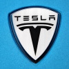
TESLA
|
The TESLA emblem logo isn’t just meant to be "T" for the initial of TESLA. According to twitter comments of TESLA CEO Elon Musk, "T" represents a cross section of the stator and rotor of an electric motor. The main part of "T" is one of the windings on the rotor. The stator is the arc line above the rotor separated by a space.
|
 English -