|
Note: If you want to see the car photos of each brand, please tap or click the brand name.
|
TOYOTA
|
 |
 |
 |
 |
 |
|
1935~
|
1935~
|
1936~
|
1936~
|
1989~
|
 |
|
|
|
|
|
2009~
|
|
|
|
|
【 Origin of Emblem and Logo 】
The overlapping of the two perpendicular ovals inside the outer oval symbolize "T" for TOYOTA. The outer oval symbolizes the world embracing TOYOTA. The space in the background within the emblem logo exhibits the "infinite values" which TOYOTA conveys to its customers: superb quality, value beyond expectation, joy of driving, innovation and integrity in safety, the environment and social responsibility.
【 History of Emblem, Logo, and Company 】
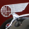
The history of TOYOTA began in September 1933 when the automobile department was established within Toyota Industries Corporation. In August 1935, the G1 truck was born as the first mass-produced truck. The G1 truck was equipped with the Shachihoko bonnet mascot and the TOYODA emblem logo. In April 1936, the Model AA was born as the first mass-produced passenger car. The Model AA was equipped with the wing bonnet mascot and the TOYODA emblem logo.
In the summer of 1936, the company name was changed from "TOYODA" to "TOYOTA" due to a public competition. The AB Phaeton, announced in September 1936, was equipped with the Japanese katakana letters "TOYOTA" emblem logo.
In August 1937, the automobile department of Toyota Industries Corporation moved from Kariya-cho to Koromo-cho, and Toyota Motor Company was established.
During the second Sino-Japanese War and the World War II, Toyota Motor Company mainly produced trucks and passenger cars. Tokai Aviation Industries was founded as a joint venture between the Toyota Motor Company and Kawasaki Aircraft Industries to produce aircraft engines. Tokai Aviation Industries is the predecessor of Aisin Corporation.
In 1950 after the World War II, the experience of the business crisis laid the foundation for the Toyota Production System. For example, the concept of Kaizen, Lean manufacturing, the kanban methodology, and so on.
After 1955, various car model emblem logos such as the crown design and the corona design have been born. The culture of adopting original design for each model continues to this day.
In July 1982, Toyota Motor Company and Toyota Motor Sales merged to form Toyota Motor Corporation. It is abbreviated as "TMC" within the Toyota Group.
In 1989, the luxury brand "Lexus" was launched. In the same year, the current TOYOTA emblem logo was born. The new design was advertised with a catch phrase "The new TOYOTA will start running", and the new emblem logo was installed from the first-generation CELSIOR. In 2009, the third-generation PRIUS was released. It was the first car to be equipped with the heat blue design exclusively for hybrid vehicles.
In 2008, TOYOTA fell into the red for the first time in 58 years due to the Lehman shock. However, the TOYOTA Group sold 8,972,000 units, making it the world's number one for the first time. The sharp drop in GM sales helped Toyota become the number one in the world.
In 2015, the vehicle development policy "TNGA (Toyota New Global Architecture)" was introduced. Significant cost reductions have been achieved by standardizing and modularizing platforms, engine parts and so on.
In 2017, the sports car brand "GR" was born. GR stands for "GAZOO Racing", and its predecessor is the sports car brand "G's", which was born in 2010.
|
Netz
|

|
|
|
|
|
|
2005~2020
|
|
|
|
|
【 Origin of Emblem and Logo 】
The Netz emblem logo represents "N" the initial of Netz symbolically and delicately, emphasizes the unique presence and premium feeling of the Netz dealer.
【 History of Emblem, Logo, and Company 】
Netz is one of the brands and sales channels distributed by TOYOTA.
The origin of Netz is the "TOYOTA AUTO" dealers which was developed at the same time as the birth of the first model Corolla Sprinter in April 1968. In August 1998, the "TOYOTA AUTO" dealers was renamed the "Netz TOYOTA" dealers. After that, in May 2004, the "Netz TOYOTA" and "TOYOTA ViSTA" dealers were integrated to born the "Netz" dealers.
In February 2005, the Netz emblem logo was first adopted by the second generation Vitz (YARiS). Since then, the Netz emblem logo has been widely adopted in the exclusive models of Netz dealers. After that, the trend of selling all models on all Toyota sales channels progressed, and at the same time, the unification of TOYOTA emblem logo progressed. As a result, the Voxy, sold in April 2020, was the last model to adopt the Netz emblem logo.
|
LEXUS
|
|
|
|
|
|
|
1989~
|
|
|
|
|
【 Origin of Emblem and Logo 】
The LEXUS emblem logo is derived from "L" the initial of LEXUS.
【 History of Emblem, Logo, and Company 】
LEXUS is the luxury brand distributed by TOYOTA. The Lexus brand was launched in North America in 1989 and in Japan in 2005.
The LEXUS emblem logo was designed in mid-1987 and officially announced in 1988. The emblem logo was first installed on LS launched in North America in 1989. LS recorded strong sales, helping LEXUS successfully enter the luxury car brand market. In the United States in the 1980s, luxury cars such as Lincoln and Cadillac that adopted heavy and traditional designs were common. LEXUS has succeeded in breaking down its traditional luxury car's dominance by realizing the high reliability, economy, and low vehicle prices.
While successful in North America, LEXUS struggled in Europe due to the persistent popularity of traditional luxury car brands such as Mercedes-Benz and BMW.
The development of the LEXUS brand in Japan was officially announced in February 2003, and GS, SC, and IS were launched at the LEXUS dealers throughout Japan from 2005.
Around the same time as the start of the Japanese business, the design philosophy "L-finesse" was defined, which conceals a much deeper design philosophy, sublimates into the realm of art with intelligent and advanced car design. This new design philosophy has contributed to the rebranding of LEXUS' global strategy. L-finesse is represented by three Japanese kanji characters which translate as "予:SEAMLESS ANTICIPATION", "純:INCISIVE SIMPLICITY", "妙:INTRIGUING ELEGANCE".
In 2008, the LEXUS CPO (Certified Pre-Owned), a certified used car dealership, was launched.
In 2018, the luxury yacht "LY650" was announced as a symbol of the challenge of "providing surprises and emotions that go beyond cars".
|
|
HONDA
|
|
Near the front bumper & bonnet
|
|
|
|

|
|
|
1963~ T360
|
1963~ S500
|
1967~ N360
|
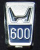
1968~ N600
|
1970~ Z
|
|
|
|
|

|
|
1971~ Life
|
1976~ Accord
|
1981~
|
1992~
|
2001~
|
Near the front fender
|
|
|
|
|
|
|
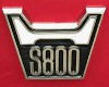
for S800
|
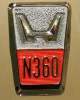
for N360
|
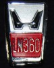
for LN360
|
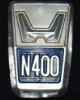
for N400
|
for N600
|
|
|
|
|
|
|
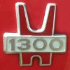
for Honda1300
|
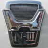
for NIII360
|
for Life,Civic
|
|
|
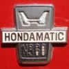
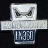
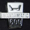
For the Hondamatic models
|
|
|
|
|
|
|
for N360
|
for LN360
|
for N600
|
|
|
【 History and origin of Emblem and Logo 】
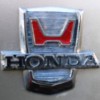
The HONDA emblem logo for automobiles was designed based on the initial "H" of the company name HONDA. On the other hand, HONDA emblem logo for motorcycles represents the wings design. This difference in emblem logo design means the uniqueness of the development fields of automobiles and motorcycles.
Currently, the letter "H" with a unified design is adopted for each car model, but before 1980, the design was changed in detail for each car model.
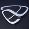
In 1963, the first mass-produced cars, T360 and S500, were fitted with the first emblem logo. T360 has a large letter "H" that covers the entire bonnet, and S500 has a small letter "H" in the center of the grill. In the N600 for export, "600" is added to the lower side of letter "H".
Since S800 released in 1966, a special design with the car name engraved has been installed on the front fender. In addition, Hondamatic-equipped cars also have a special design. The emblem logo engraved with the car name continued to be installed until NIII 360 released in 1970.
Since Honda 1300 released in 1969, the horizontally long letter "H" has been changed to an elongated shape. This redesigned letter "H" was attached like a bonnet mascot on Honda Z and Accord. On the other hand, for Civic, Life, Honda 1300, etc., the newly designed letter "H" was attached in the center of the grill.
In 1981, the second generation Accord and Vigor adopted almost the same design as the current emblem logo. It looks more angular than the current design, this contour is derived from the shape of the shamisen. The shamisen is a three-stringed traditional Japanese musical instrument. The reason why the shamisen was chosen is that the founder Soichiro Honda was very impressed with the tone of the shamisen.
In 1992, the first Type R model, NSX was attached with the red emblem.
Since 2001, the current design with rounded contours was born.
【 History of Company and Brand 】
In 1946, the founder Soichiro Honda developed the concept of using the former Imperial Japanese Army's generator engines as auxiliary power for bicycles. These bicycles that were actually put on the market were very well received by customers. Soichiro Honda decided to develop and original engine. Honda Motor Co., Ltd. was founded in 1948, two years later. In the 1950s, the farming engines and motorcycles such as the Super Cub were released. Mass production of automobiles began in 1963. In 1972, HONDA becomes the first manufacturer in the world to fully comply with the most stringent emission regulations at the time, the United States Clean Air Act, or the so-called "Muskie Law".
In recent years, HONDA has continued to develop products in a wide range of fields. As a representative product, the humanoid robot ASIMO was announced in 2000, and the HondaJet started delivery in 2015.
Takeo Fujisawa and Soichiro Honda have grown HONDA into a global company. As Fujisawa said, "The president should be from an engineer", HONDA's successive presidents are all from engineers.
In addition, Honda's aftermarket parts manufacturer "無限 = MUGEN" was established by Hirotoshi Honda, the eldest son of Soichiro Honda.
|
ACURA
|

|
|
|
|
|
|
1989~
|
|
|
|
|
【 Origin of Emblem and Logo 】
The ACURA emblem logo is derived from "A", which is the upside down of HONDA emblem logo "H". This design illustrates a mathematical compass, or vernier caliper, the tool that best symbolizes quality and accuracy.
【 History of Emblem, Logo, and Company 】
ACURA is the luxury brand distributed by HONDA.
The history of the brand began in 1986 in the United States and Canada. First, Legend and Integra are on sale as the ACURA brand. In the first year, ACURA ranked first in the customer satisfaction survey of automobile brands. It has succeeded in expanding its name recognition as a premium brand.
The ACURA emblem logo was first installed on NSX launched in North America in 1990. From its founding to 1990, only the letters "ACURA" emblem logo was installed.
ACURA was able to enter the North American luxury car market faster than LEXUS and INFINITI. The reason for the early entry is that the local infrastructure was built a few years ago. Specifically, it is related to the HONDA's establishment of a local production plant in Ohio in 1982 and R&D center in 1985. Currently, the global expansion of the ACURA brand is progressing. On the other hand, there are some areas like Japan that do not dare to expand the ACURA brand. The brand expansion to Japan was announced in 2005, but it was withdrawn in 2008 due to the effects of the global financial crisis.
|
NISSAN
|
|
|
|
|
|
|
|
|
|
|
The NISSAN emblem logo is derived from the design of the old DATSUN one. The old DATSUN emblem logo was designed by Ryozo Yoshizaki and Tsunezaburo Tanaka with reference to the CHEVROLET one. This design consists of a cobalt blue band with a sky motif placed on the red sun, and the white letters "DATSUN". First of all, the letters "DATSUN" was rewritten as "NISSAN" in Japanese katakana, and used as the corporate logo of the Nissan Konzern. Then, at the same time as the dismantling of the financial conglomerate after World War II, the corporate logo for Nissan Motor Corporation was born, in which katakana was rewritten into the Roman alphabet "NISSAN". In 1983, the 50th anniversary of Nissan's founding, the emblem logo was redesigned with the font specified by Pentagram of the United States. Then in 2001, the design was changed to a three-dimensional design by an in-house competition. The design sample for an in-house competition was displayed in the office of Carlos Ghosn, who was once the president of Nissan Motor Corporation.
|
INFINITI
|
|
|
|
|
|
|
1989~
|
|
Reference (*1)
|
|
|
*1 for Q45 made by Cloisonne
【 Origin of Emblem and Logo 】
The INFINITI emblem logo represents Mount Fuji in Japan and the road to infinity.
【 History of Emblem, Logo, and Company 】
INFINITI is the luxury brand distributed by NISSAN.
NISSAN established the “Horizon Task Force” to begin planning the establishment of a luxury car brand in 1985, then the INFINITI name and its emblem logo design were announced in 1987.
The INFINITI brand expansion began in the United States in 1989. At the same time, the INFINITI emblem logo was first installed on Q45 and M30, which were the initial lineup. In addition, the emblem logo for Q45 was made by Cloisonne that emphasized pure Japanese style, and it was a specification suitable for a flagship car.
Currently, the global expansion of the INFINITI brand is progressing except in Europe and Japan. The headquarters was relocated to Hong Kong from 2012, but it was relocated to Yokohama, where Nissan's head office is located in 2020.
|
DATSUN
|
The current DATSUN emblem logo is the second-generation design that was modified in 2010s. This design expresses the DNA of reliability and strength that DATSUN had in the past. The blue color of background indicates "reliability". The first-generation emblem logo was designed by Ryozo Yoshizaki and Tsunezaburo Tanaka with reference to the CHEVROLET one. This design consists of a cobalt blue band with a sky motif placed on the red sun, and the white letters "DATSUN".
|
PRINCE
|
The PRINCE emblem logo was designed based on the initial of "PRINCE". This symbolic "P" is still used by PRINCE KAIUN CO.,LTD. as the corporate logo.
|
MAZDA
|
The current MAZDA emblem logo was adopted since 1997, symbolizes the value of the products and services provided by MAZDA. The V-shaped wings are suggestive of MAZDA's growth, improvement, flexible thinking, creativity, vitality, kindness and resilience. The MAZDA emblem logo also stands for MAZDA’s determination to "pursue ongoing improvements to drive powerful, continuous growth" expressed by a pair of wings shaped like a letter "M" in an oval.
|
ẽfini
|
The ẽfini emblem logo has the motif of "∞" which means infinity.
|
AUTOZAM
|
The AUTOZAM emblem logo consists of three blue mountain-like designs on a red background, but the exact origin of the emblem logo is unknown.
|
EUNOS
|
The EUNOS emblem logo has a motif of "十二単 = Junihitoe", twelve-layered ceremonial Japanese kimono, which is one of the traditional Japanese costumes.
|
SUZUKI
|
The SUZUKI emblem logo was designed based on the initial "S" of the company name SUZUKI. This design is widely known as a symbol of SUZUKI, has been adopted since 1958. This emblem logo is often used for vehicles products, motorcycle products, printed matter, signboards and so on.
|
SUBARU
|
The "six-stars" of SUBARU emblem logo is derived from the Pleiades star cluster in Taurus. The big stars represent Fuji Heavy Industries, the five small stars represent the merged companies, Fuji Industries, Fuji Jidousya Industry, Omiya Fuji Industries, Utsunomiya Sharyou, and Tokyo Fuji Industries. The Japanese word "統べる = suberu" means "united", this "統べる = suberu" and "昴 = SUBARU" have similar pronunciations. Fuji Heavy Industries has used the term to describe how the Pleiades constellation is a unification of the stars. The SUBARU emblem logo was first adopted on Subaru 360, which released in 1958. Tetsuzo Sasaki is Japanese industrial designer who was in charge of the basic design of the Subaru 360. He designed this design based on the the open called idea submitted by employees of Fuji Heavy Industries. Although several design changes have been made since then, the basic motif of six-stars has been maintained.
|
DAIHATSU
|
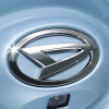
The DAIHATSU emblem logo was designed based on the initial "D" of the company name DAIHATSU. This design has been adopted since 1966.
|
MITSUBISHI
|
|
|
|
|
|
|
|
|
|
|
The name "MITSUBISHI" refers to the three-diamond emblem logo. When MITSUBISHI was founded, Tsukumo Shokai adopted a diamond-shaped mark as the ship flag. This diamond-shape became the prototype of MITSUBISHI corporate logo. The current corporate logo was born in 1897 by combining the family crest of the founder, Yataro Iwasaki, "三階菱 = Sangaibishi," and the family crest of the Yamauchi clan, the lord of the Tosa-han, "三ツ柏 = Mitsugashiwa". Also, the red color of corporate logo is derived from the red three diamonds on the white background written on the flag of the ship owned by Yataro Iwasaki.
"三菱 = MITSUBISHI" is a combination of the words "三 = mitsu" and "菱 = hishi". "三 = mitsu" means three. "菱 = hishi" means water chestnut, and Japanese have used the word for a long time to denote a rhombus or diamond shape. Japanese often bend the "h" sound to a "b" sound when it occurs in the middle of a word. So Japanese pronounce the combination of "三 = mitsu" and "菱 = hishi" as "三菱 = MITSUBISHI".
|
MITSUOKA
|
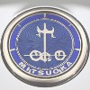
The MITSUOKA emblem logo is derived from the hieroglyph of the Japanese word "車 = kuruma", which was created around 800 BC. "車 = kuruma" means a car. The hieroglyph of "車" represents a carriage and an ox-cart. This emblem logo was created based on the hieroglyphs, which are the origins of the characters "車", in order to "never forget the origin of car".
|
ISUZU
|
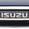
The ISUZU emblem logo is a simple word mark with a modern design of characters "ISUZU". This word mark symbolically expresses the corporate philosophy of "creating products and services that truly satisfy customers around the world, contributing to society, and developing as a company with abundant humanity". The two pillars in the old emblem logo adopted from 1974 to 1991 express "ISUZU grows with customers" and "ISUZU grows in harmony with society".
|
HINO
|
The HINO emblem logo was designed based on the initial "H" of the company name HINO. This design has been adopted since 1994, also expresses the fusion of the company's dynamism and expansivity as it advances into the future. Visually, this is a stylistic depiction of a sunrise on the horizon. Arcs connected to the left and right of the central line express the HINO's desire for a sense of logistic unity, connecting the mainline with the terminals. A powerful force generating horizontal expansion along the "transportation route" of this central line symbolizes the HINO's commitment to progress. The mutually attracting curved sides symbolize the balance between the HINO's advanced technologies and the environment. Finally, the double-headed arrow shape embodies the company's longstanding credo as a truck and bus manufacturer for "safe passage to and from".
|
MITSUBISHI FUSO
|
|
|
|
|
|
|
|
|
|
|
The MITSUBISHI FUSO emblem logo is a combination of the three-diamond and a word mark designed based on the characters "FUSO". The name "MITSUBISHI" refers to the three-diamond emblem logo. When MITSUBISHI was founded, Tsukumo Shokai adopted a diamond-shaped mark as the ship flag. This diamond-shape became the prototype of MITSUBISHI corporate logo. The current corporate logo was born in 1897 by combining the family crest of the founder, Yataro Iwasaki, "三階菱 = Sangaibishi," and the family crest of the Yamauchi clan, the lord of the Tosa-han, "三ツ柏 = Mitsugashiwa". Also, the red color of corporate logo is derived from the red three diamonds on the white background written on the flag of the ship owned by Yataro Iwasaki.
"三菱 = MITSUBISHI" is a combination of the words "三 = mitsu" and "菱 = hishi". "三 = mitsu" means three. "菱 = hishi" means water chestnut, and Japanese have used the word for a long time to denote a rhombus or diamond shape. Japanese often bend the "h" sound to a "b" sound when it occurs in the middle of a word. So Japanese pronounce the combination of "三 = mitsu" and "菱 = hishi" as "三菱 = MITSUBISHI".
|
UD TRUCKS
(Former
NISSAN DIESEL
) |
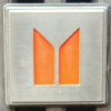
The UD TRUCKS emblem logo "UD" is derived from the abbreviation for the 2-cycle Uniflow Scavenging Diesel Engine released in 1955. The U and D red circle developed at the same time as this engine is the origin of the current emblem logo.
|
 English -