|

|

|
|

|
|
|
1953~ (*1)
|
1964~ (*2)
|
1986~
|
1994~
|
2000~
|
2021~
|
*1 for bicycles, *2 for bicycles, motorcycles, three-wheeled trucks
【 Origin of Emblem and Logo 】
The KIA emblem logo is based on the company name "KIA", and the emblems design saw uncountable changes over its history.
【 History of Emblem, Logo, and Company 】
In 1944, Chul-Ho Kim found Kyungsung Precision Industry. The company manufactured bicycle parts and steel pipes by hand.
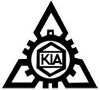
In 1952, the company changed its name to KIA Industries. In the following year, the first emblem logo was appeared. This is based on a cross section of a triangular scale, a gear that is a symbol of the machine industry, a benzene ring that is a symbol of the chemical industry, and the company name "KIA". This emblem logo was attached to the bicycle "3000 리호" produced at the Busan factory.
In May 1964, a new emblem logo was born by an in-house competition to commemorate the 20th anniversary of the company's founding. This emblem logo was changed based on the opinion that the previous design did not have the wheels that symbolize the automobile industry and the design was complicated. The fact that it has been producing three-wheeled trucks and motorcycles since 1962 also influenced this design change. This emblem logo is a combination of "ㄱ" and "○", and represents the front fork and front wheel of a three-wheeled truck and motorcycles. In addition, "ㄱ" means "起 = KI" of KIA, and "○" means "亜 = A" of KIA.
In November 1986, the first emblem logo for the cars manufactured by KIA was born. The design consists the three wavy lines "Kia's flag" above the letters Kia, and expresses "the focusing on the technology, cooperation and friendship", "the leading the automobile industry through the constant research and development", "the desire for social development", and "the future-oriented corporate philosophy". It also comes with a wish to become a world-class automobile manufacturer for the brighter and richer future.
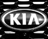
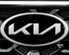
In January 1994, the famous emblem logo that combined the oval and KIA letters was adopted. This design was changed to commemorate the 50th anniversary of the company's founding, and expresses "the thriving in the global market" as the vision of the 21st century. It also means the unification thought of all employees and the strengthening of the international competitiveness. The oval shape symbolizes the earth, the future orientation, the advancedness, and the intimate communication. The "KIA" in the oval expresses the driving force of KIA company and the infinite possibilities of KIA vehicles.
In 2000, the Millennium design appeared and was used only in Korea. However, this type was not well recognized by Korean people, and it returned to the oval type in 2004.
In January 2021, the newest KIA emblem logo, which looks like "KN", was announced via YouTube and Facebook.
|
 English -